Surface Studio Review
When Microsoft unveiled the Surface Studio back in October 2016, like most people, I was impressed with how it looked. The idea of having a single desktop device which could do everything sounded perfect.
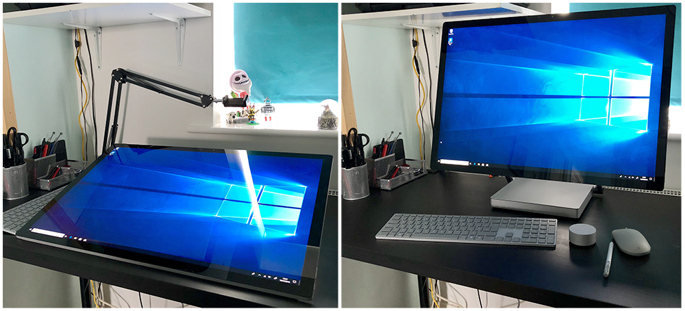
It had a computer built into the base, a gorgeous, large screen and what’s more, the screen could be lowered to become an artists graphics tablet. No need to buy each piece separately or find different parts to get the workspace you desire, it was all there in one compact package.
Since its release its had some mixed reviews. People seem to love the screen and in general its been welcomed by the creative industry with open arms. For me though, someone who works with both 2D and 3D, I was always sceptical that it would comfortably handle both fields. Could it be a device to replace my entire studio setup?
I was recently given the opportunity to test this out as Microsoft sent me one to try for a few weeks.
So, once the month was over, was I itching to buy my own?
Read on to find out…
Unboxing
When being sent devices to review, Microsoft don’t just ship out a brand-new system which is boxed as it would be if you purchased one. Instead they have a few units available which are loaned to an artist to try and then its wiped and passed onto the next. So, writing a piece about unboxing it seems a little redundant.
Instead, it arrived in a large box, like the ones typically used by musicians to transport their instruments. It was well padded and came in perfect condition.
Because its all a single unit, setup was very easy. All I had to do was pull it from the box, plug it in and wait for it to boot into Windows 10, which happened in a matter of seconds.In addition to the Surface Studio, I also received a Bluetooth mouse and keyboard as well as the Surface Pen. I was also sent the Dial too, so I could get the full Surface experience.
Once I got into Windows, (because this is a review unit there was no need to go through the whole setup process or download an endless stream of updates) I did experience some issues with connecting the accessories, but after a few minutes they all started working and I could start creating.
The Device
The version I was sent was the Intel Core i7 with 16GB of Ram and the NVIDIA GeForce GTX 965M 2GB GPU, so specs wise it’s not the greatest device but to be honest I never get bogged down with specifications. To me, it’s what it’s like to use that’s the key.
For testing purposes, I was comparing the Surface Studio to the device I use daily, which is the Wacom MobileStudioPro 16 with an Intel Core i7 processor, 16GB of Ram and the NVIDIA Quadro M1000M 4GB GPU. Obviously, the screen sizes are different, but I wanted to see how they compared both performance wise and how they felt to paint on.
As you already know the Surface Studio is a beautiful device. The main base is small with two arms coming from either side to hold the screen above it. At the rear you have four USB 3.0 connection slots plus an SD card reader, Mini DisplayPort and a headphone jack, although I’m not entirely sure why they were hidden behind the device.
Having them at the rear meant they were awkward to access as you had to raise the screen, pull the whole device towards you and twist it just to plug in a USB stick or your headphones. I appreciate Microsoft were probably thinking of the aesthetics of the system but having the most frequently accessed ports at the front would make life a whole lot easier. If they were worried about how they looked, they could just add a flap to cover them when not being used.
The Screen
There’s no getting around it, the screen is the focal point of this device and its gorgeous. It’s a 28-inch PixelSense display with a resolution of 4500 by 3000 pixels, (192 DPI). Its bright, colourful and so clear, its truly amazing to look at. Everything is pin sharp. The text is crisp and there’s none of the “grain” you tend to get with a Wacom device, which is nice.
This all sounds perfect, but the trade-off is the screens reflectivity. As I worked on a brighter canvas everything was fine but as soon as I started to focus on darker areas all I could see was my reflection looking back, which was distracting to say the least. I ended up working with the blinds closed just to minimise the effect, which for a device which is aimed at creatives, is not ideal.
The Stand
Making a good stand or hinge seems to be where Microsoft excel. They achieved it with the Surface Pro devices and the Surface Book and now, with the Surface Studio, they hit the ball out of the park again with the “Zero Gravity Hinge”.
It appears to be so simple but there’s a lot going on to give you the right amount of control and support at the same time. You can lower and raise the screen with one finger, just as advertised, and it moves effortlessly. This did make me wonder if you could only use the screen at the extremes but no, I mainly used it around 75% lowered and had no stability issues.
The Surface Pen
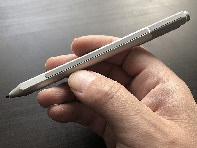
Ok, so when it comes to the Surface Pen we had a rocky start to our relationship. After a couple of hours use, the pen stopped working. I tried to reconnect it via Bluetooth, checked for new drivers and restarted a lot of times but nothing seemed to fix it. The Surface Studio had stopped recognising it, so I could only assume the battery had died.
The search began for the illusive AAAA batteries. I spent most of the day going from one shop to another but nowhere stocked them which meant I then had to order some online and wait a few days for delivery.
From a production point of view this would have been devastating. Had I needed to complete some work for a client I would have been in trouble because I then had no way to paint on the screen. Luckily, I had another pen which came with the Surface Book which seemed to connect and work ok, so I ended up using that as a backup.
This did however make me wonder why Microsoft chose to use batteries at all. If the pen must be powered why not make it rechargeable? Better still, make it rechargeable and have the Surface Studio wirelessly charge it when its connected to the side of the screen. The same could be said of the mouse, make that rechargeable too and add a dock to the system to keep it topped up.
Anyway, sorry about the rant but it was important to mention the issues I had as I think they are important ones, and ones to consider.
Unfortunately, the pen being powered wasn’t its only issue. I just didn’t find it comfortable to use and the button on the shaft was too stiff for my liking. I also never used the eraser button at the opposite end.
The Dial
Along with the Surface Studio, Microsoft also sent the Dial which is sold separately. This is a large disk which you can press, and it also rotates, allowing you to perform a wide selection of tasks depending on the program your using.
Initially I thought this might turn out to be more of a gimmick, and I wouldn’t use it, but it surprised me. It took a bit of time to get used to but then it felt quite natural to increase my brush size or hardness with it.
One feature is the ability to place it anywhere on the screen and a nice user interface appears around it, showing the options available, (which are specific to that application, and can be used by the developers to bring you more functionality). This helped to make me feel like it was part of the same system and in practice worked well. You simply rotate the dial to the option you want and press down to select it. Nice and easy.I did find however that unless the screen was at its lowest position the Dial wouldn’t stay still. Instead it would gradually creep down, so I would need to keep moving it to maintain its position. In the end I just placed it flat on the desk and used it there.
As good as the Dial is its simplicity may be its weakness. I did feel the need to have just a few buttons on it, so I could access Control, Alt and Shift quickly or maybe even Undo. With that said, I was quite comfortable using the keyboard and the Dial together.
Configurability
When it comes to configuring the Surface Pen and Dial you don’t have many options to play with. For the Pen you can change the pressure curve but when it comes to configuring the buttons you are limited. The only configurable one is the eraser, but I would have loved to be able to assign Alt to the one on the shaft instead of the default right click.
With the Dial you have a little more room to play with. You can change the default actions which are available to you when you press and hold it down. You can also specify what the Dial will do on a per application basis. As an example, you can setup Photoshop so rotating the Dial changes the brush size and clicking the Dial will quickly undo your last action.
Its limited but at least you have some options to play with to tailor the experience to your own workflow.
Digital Art Use
So, what was the Surface Studio like to use, and remember I had the device for a month so was working in a production environment.
In general, when used as a desktop for tasks like writing documents, surfing the web and doing other daily tasks it performed admirably. I would raise the screen, reposition the keyboard and it would be as if I was sat at my usual desktop machine. The huge screen also meant I could multitask and get more work done as I wasn’t restricted by space.
I did have connectivity issues with the mouse, keyboard and Dial. If you don’t use them for a while they turn off or disconnect, probably to save battery life, but it seemed like it would take a little longer than necessary to get them working again, which can be a little frustrating. On the odd occasion I had to do a full system restart before they connected again.
Rather than give an overview of what it was like to create on I have added specific sections below, so you can jump to the application you use more frequently.
Photoshop CC
I wanted to start with Photoshop as I use this application most days when working on my portraits. I also have a workflow which fits my style, so wondered if that would translate to the Surface Studio.
I decided due to the time I had, I would paint a portrait from start to finish, to test the system properly. First, I found the larger canvas liberating. I had so much more room to work I could have multiple reference images open at the same time and didn’t feel like they were intruding on my canvas. I can feel a little restricted with the MobileStudioPro but its screen is 12 inches smaller so it’s an unfair comparison.
I didn’t experience any issues of parallax, (the distance between the pen tip and the cursor) or jittering, although Photoshop has a Smoothing option to help illuminate this. I also never had blobbing, which is when the pen just drops a solid blob or line as you paint, (something the MobileStudioPro does suffer from). I did experience some strokes being painted when the pen wasn’t touching the screen and for some reason, undoing them changed my layer selection which I didn’t always notice, and this ended up with me having to redo sections of the painting.
Photoshop never hung as it worked out my stroke or how much it should smooth the stroke, again something I have had issues with on the Wacom device. I think in general Adobes painting package performed much better on the Surface Studio. It felt more responsive and less buggy.
With that in mind, I actually didn’t like the painting experience. First, the Surface Studio has 1,024 levels of pressure sensitivity whereas the MobileStudioPro has 8,192. Many people say you can’t really tell the difference, but I did. I couldn’t achieve the same level of shading as I could on the Wacom.
There’s also the way the pen feels on the screen. You can change the Surface Pen tips and I did a few times, trying to replicate that pen on paper experience you get on the MobileStudioPro, but it always felt like drawing on glass.
So yes, the Surface Studio performed better, and the screen was amazing to work on, but when it comes to the experience, I had to go back to Wacom.
Maya (2018)
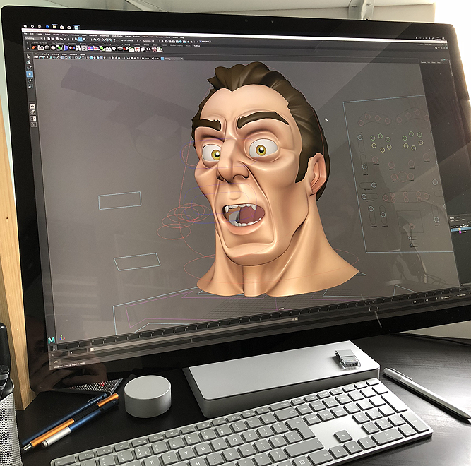
Raising the screen, I could convert the Surface Studio back into a desktop and use the mouse and keyboard to work in my main application, Maya.
Again, the screen size gave me so much room to work and because of the configuration, it felt natural and I also had full access to my hotkeys.
Performance wise I couldn’t fault it. I could create and throw around high polygon models without an issue, plus Soft Selection was possibly more responsive than on my desktop (a Dell Precision 7910) which is always a good test.
I did try some basic dynamics simulations as well as some rendering and it seemed to handle them well. Although to be honest I don’t feel like I was really pushing the system with those tests.
All in all, I would comfortably work in Maya on the Surface Studio.
ZBrush
This was going to be the big test for the Surface Studio and one that I was asked about the most. I installed ZBrush, opened it and began sculpting but there was no pressure variation registering on the model. My heart sank because I have experienced the same issue with the Surface Pro devices and the Surface Book.
Because of my previous issues I already knew the problem and that was the missing WinTab drivers, which surprised me as I would expect these to be installed as standard on a creative device. I spent a few days trying to find suitable drivers, but I couldn’t get any to work so I eventually gave up and focused on other application tests.
Finally, just before the Surface Studio was about to be returned I tried a WinTab driver I found for the Surface Pro 3 and it worked. It seemed stable enough and now I could sculpt, but then the issue was with performance and ZBrush did seem to struggle and stutter when moving around a mere 1 million polygon model.
Should You Invest?
There’s a lot to love about the Surface Studio. The design, the stand and the screen are amazing, I just love the concept behind it.For normal desktop work and even 3D you would be happy using it, although for the price you could get a decent PC with a better GPU for less. That’s unless you need the screen for painting and for that I couldn’t fault it.
In my opinion, if your thinking of upgrading from Surface Pro or even an iPad Pro you will love it. I do think Microsoft have a long way to go before they win the hearts of Wacom users, they are close and with a few key changes they could tip the balance. It just comes down to whether they listen to their target audience and make the appropriate revisions in the Surface Studio 2.
Although Microsoft supplied the device for me to test, the opinions offered in this review are my own.


